A comprehensive guide to maintaining consistency across all Oranda Therapeutics brand touchpoints. These guidelines ensure our visual identity reflects the premium, purposeful, and compassionate nature of our work in rare disease therapeutics.
Version 2.0 - March 2026
Scroll to explore
Introduction
Brand Overview
Oranda Therapeutics is a rare disease company focused on championing sustainable access to medicines across Europe. Our brand reflects our commitment to innovation, compassion, and collaboration - values that guide everything we do, from our partnerships with pharmaceutical companies to our engagement with healthcare systems and patient communities.
Our visual identity is designed to convey authority and warmth in equal measure. The brand system uses a refined colour palette anchored by our signature orange, paired with sophisticated typography and purposeful imagery that speaks to both the scientific rigour and human empathy at the heart of our mission.
Introduction
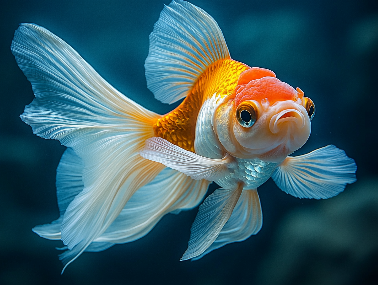
The Oranda
Oranda Goldfish Image
Place oranda-fish.jpg in assets/images/
Why Oranda?
Our company is named after the Oranda, a rare and beautiful breed of goldfish symbolising longevity, adaptability, personal growth and the pursuit of fulfilment. Just as the Oranda goldfish is prized for its distinctive appearance and resilience, our company is built on the belief that rarity should be celebrated, not overlooked.
Beauty in Difference
The Oranda serves as a reminder that everyone is unique and can live positive and purposeful lives. Beauty lies in our differences. This philosophy extends directly into our work - championing access to medicines for rare diseases, where every patient matters and every condition deserves attention, no matter how rare.
From Fish to Brand
The fluid, organic form of the Oranda goldfish inspired our logomark. The warm gradient palette - flowing from deep red through to vibrant orange - captures the vitality, movement and warmth that define both the fish and our brand. The circular form represents wholeness, continuity and the cycles of care that connect patients, partners and healthcare systems.
Introduction
Mission & Values
Our Mission
To champion access to rare disease medicines, ensuring patients across Europe receive the treatments they need through agile, cost-effective commercialisation and trusted partnerships.
01
Compassion
Patients are at the centre of everything we do. We are driven by the desire to improve lives and reduce the burden of rare diseases on individuals and their families.
02
Innovation
We embrace creative and agile approaches to commercialisation, finding new pathways to bring medicines to patients faster and more efficiently.
03
Openness
We operate with transparency and integrity, building trust with our partners, stakeholders, and the communities we serve.
04
Collaboration
We believe in the power of partnership. By working alongside like-minded organisations, we amplify our impact and create lasting value.
Tone of Voice
Writing Principles
The way we write is as important as how we look. Our tone should be confident without being arrogant, warm without being casual, and expert without being exclusionary.
01
Clear & Purposeful
Every word should earn its place. Avoid jargon when plain language will do. Be direct and specific about what we do and why it matters.
Do
"We bring rare disease medicines to patients who need them, faster."
Don't
"We leverage our synergistic capabilities to optimise the commercialisation lifecycle."
02
Human & Empathetic
Behind every statistic is a person. Our writing should acknowledge the human impact of rare diseases and the hope that treatment brings.
Do
"Every patient deserves access to the treatment that could change their life."
Don't
"Market penetration in the rare disease vertical demonstrates significant ROI potential."
03
Confident & Expert
We know our field. Write with authority but remain accessible. Reference evidence and outcomes without overwhelming the reader.
Do
"Our experienced team has commercialised medicines across 15 European markets."
Don't
"We think we might be able to help in some markets."
04
Collaborative & Inclusive
We achieve more together. Use language that invites partnership and demonstrates shared purpose rather than positioning Oranda as the sole hero.
Do
"Together with our partners, we are building a sustainable access model."
Don't
"We are the only company capable of delivering these results."
Tone of Voice
Key Messages
These core messages should be adapted and woven into communications as appropriate. They represent the foundational truths of the Oranda brand.
Brand Promise
Championing access to rare disease medicines across Europe through trusted partnerships and agile commercialisation.
Differentiator
We combine the deep expertise of industry veterans with the speed and flexibility of a focused, entrepreneurial team.
Patient Impact
Every decision we make is guided by the patients who are waiting for access to treatments that could transform their lives.
Partnership Value
We work alongside pharmaceutical companies as true partners, sharing risk, aligning incentives, and delivering sustainable access.
European Focus
Our deep understanding of European healthcare systems enables us to navigate complex market access pathways efficiently and effectively.
Sustainability
We build models that deliver long-term, sustainable access - not short-term commercial wins. Our success is measured by patient outcomes.
Logo
Primary Logo
The Oranda logo is the cornerstone of our brand identity. It represents our commitment to rare disease therapeutics and should always be treated with care and consistency.
The Oranda Mark
The Oranda logomark draws inspiration from the Oranda goldfish - a symbol of resilience, beauty, and rarity. The fluid, organic form captures movement and vitality, while the warm gradient palette conveys energy and optimism. The combination of the mark with our logotype creates a distinctive and memorable brand signature.
Logo
Logo Variations
The logo is available in several formats to ensure it reproduces well across all applications and backgrounds.
Full colour on whitePrimary usage
Full colour on greyAlternative background
Monochrome blackPrint / engravings only
Monochrome whiteDark backgrounds
Logomark onlyFavicons, avatars, small spaces
Logotype onlyWhen mark is shown elsewhere
Logo
Clear Space & Sizing
xxxx
Clear Space
The minimum required clear space around the logo is defined by the measurement "x", equal to the x-height of the logotype. This clear space must be kept free of all other graphical and visual elements to maintain the logo's integrity and impact.
x= x-height of the logotype "ORANDA"
Safe Zone
The safe zone extends beyond the clear space. Other graphical and visual elements can be safely positioned within the safe zone but outside the clear space area.
Minimum Size
To ensure legibility, the logo should never be reproduced smaller than the minimum sizes specified below.
Print25mm wide
Digital120px wide
Logomark only16px / 5mm
Sizing Ratios
When scaling the logo, always maintain the original aspect ratio. Never stretch, compress, or distort the logo in any direction.
Logo
Logo Placement
The full colour logo on white or reversed out on dark backgrounds is the preferred usage. The logo should appear prominently on all primary brand materials including the website, presentations, business cards, and official correspondence.
Business Card
Letterhead
Presentation
Logo
Logo Misuse
To maintain the integrity of the Oranda brand, avoid the following common misuses of the logo. When in doubt, refer to these guidelines or contact the brand team.
Do not stretch or distort
Do not change the colours
Do not rotate the logo
Do not add effects or shadows
Do not crop the logo
Do not place on busy backgrounds
Logo
Logo Downloads
Download approved logo files in all formats and colour variations. All files are provided in PNG, SVG, and EPS formats.
The Oranda primary colour palette is anchored by our signature orange, supported by a deep red and black. These colours form the foundation of the brand across all touchpoints.
The digital palette extends the core brand colours with additional tones optimised for screen use. These are used across the website and digital communications.
Cream#FBFBF4Light backgrounds, text on dark
Dark#0A0A0APrimary dark background
Dark Secondary#141414Card backgrounds, depth layers
Web Orange#E07850CTAs, links, accents (both modes)
Orange Light#F4A261Hover states, secondary accent
Text Lightrgba(251,251,244,0.9)Primary text on dark
Text Mutedrgba(251,251,244,0.6)Secondary text, descriptions
Borderrgba(251,251,244,0.1)Dividers, card borders
Colour
Colour Usage
Colour application should maintain hierarchy and readability. Follow these guidelines to ensure consistent and accessible colour usage across all materials.
Light mode
Dark mode
The Orange Ambient Gradient
A signature element of the Oranda digital brand is the subtle warm orange gradient that bleeds softly across backgrounds. This radial glow creates a sense of warmth, optimism, and premium quality that distinguishes Oranda materials from clinical or sterile pharmaceutical aesthetics.
The gradient should always be understated - felt more than seen. It typically radiates from the right or top-right of a layout, using the brand orange at very low opacity (3-8%) as a radial gradient over the base background colour. It appears in both light and dark modes, adapting to maintain subtlety against each background.
Dark moderadial-gradient(ellipse, rgba(224, 120, 80, 0.04-0.06), transparent)
Do
Use Oranda Orange as the primary accent colour for calls-to-action, key highlights, and brand moments.
Do
Maintain sufficient contrast between text and background colours. Use light text on dark backgrounds and dark text on light backgrounds.
Do
Use the tint variations (75%, 50%, 25%) for supporting elements and to create depth in layouts.
Don't
Use unapproved colour variations or adjust the brand colours to match personal preference.
Don't
Use red as the dominant colour in layouts. It should be used sparingly and predominantly within the logo gradient.
Don't
Use orange for critical small text (below 18px) on light backgrounds where accessibility is paramount. Reserve orange for headings, CTAs, and accent elements in light mode.
Do
Be aware that the brand orange (#E07850) achieves full WCAG AA contrast compliance in dark mode but falls below the 4.5:1 threshold for small text in light mode. This is an accepted brand decision - see the Accessibility section for full details.
Typography
Typography Evolution
The Oranda typographic system has evolved alongside the brand. Our original guidelines specified Verdana across all touchpoints. As the brand's digital presence matured and our premium positioning sharpened, we introduced a more expressive type palette for digital channels while maintaining practical, universally available typefaces for print and corporate documents.
Why the change?
Verdana was designed in 1996 for low-resolution screens. While excellent for legibility, its wide letterforms and utilitarian character don't reflect the sophistication and authority that Oranda's positioning demands. As screens improved and web font technology matured, we had the opportunity to elevate the brand's typographic voice without sacrificing readability.
The guiding principle
Both print and digital type systems follow the same logic: an expressive serif for headings that conveys editorial authority and warmth, paired with a clean, highly legible sans-serif for body text. The specific typefaces differ by medium, but the voice remains consistent.
Print & Corporate
For printed materials, presentations, Word documents, and any context where custom font installation cannot be guaranteed, use system-available typefaces.
Georgia - Headings
Championing access to rare disease medicines
Georgia is the print equivalent of Playfair Display - a transitional serif with warmth and authority. Available on all operating systems.
Weights: Regular, BoldSystem font - no installation required
Verdana - Body Text
Oranda Therapeutics is a rare disease company focused on championing sustainable access to medicines across Europe. Our team combines deep pharmaceutical expertise with entrepreneurial agility to bring treatments to patients faster.
Body text, correspondence, documents. Verdana's generous spacing remains ideal for printed body copy at small sizes.
Weights: Regular, Bold, Italic, Bold ItalicSystem font - no installation required
Section Heading in Georgia
Body text in Verdana provides reliable legibility across all print contexts, from business cards to annual reports.
Print pairing: Georgia + Verdana
Typography
Digital Typography
For digital applications - the website, email campaigns, social media graphics, and any context where web fonts can be loaded - we use a pairing of Playfair Display and Inter. This combination brings editorial elegance and modern clarity that reflects Oranda's premium positioning.
Digital & Web
Custom web fonts loaded via Google Fonts. Playfair Display provides the distinctive character that sets Oranda apart digitally, while Inter delivers exceptional screen readability with superior OpenType features and tighter metrics than Verdana.
Playfair Display - Headlines
Championing access to rare disease medicines
Page titles, hero text, section headings. Its high contrast and elegant ball terminals bring a sense of heritage and sophistication.
Weights: 400, 500, 600Source: Google FontsFallback: Georgia, serif
Inter - Body & UI
Oranda Therapeutics is a rare disease company focused on championing sustainable access to medicines across Europe. Our team combines deep pharmaceutical expertise with entrepreneurial agility to bring treatments to patients faster.
Body text, navigation, buttons, captions. Purpose-built for digital interfaces with excellent legibility at all sizes.
Weights: 300, 400, 500, 600Source: Google FontsFallback: -apple-system, sans-serif
Eyebrow Text
Section Heading in Playfair Display
Body text in Inter provides excellent readability at all sizes, with a neutral, modern tone that pairs beautifully with the more characterful Playfair Display headings.
Digital pairing: Playfair Display + Inter
Cross-Medium Reference
When moving content between print and digital, use these equivalent pairings to maintain typographic consistency.
RolePrintDigital
HeadingsGeorgiaPlayfair Display
Body textVerdanaInter
UI / LabelsVerdanaInter
QuotesGeorgia ItalicPlayfair Italic
Typography
Type Hierarchy
A clear typographic hierarchy ensures content is scannable and accessible. The following scale is used across all digital touchpoints.
H1clamp(2.5rem, 6vw, 5rem)
Heading One
H2clamp(2rem, 4vw, 3.5rem)
Heading Two
H3clamp(1.5rem, 3vw, 2.5rem)
Heading Three
H4clamp(1.25rem, 2vw, 1.75rem)
Heading Four
Eyebrow0.75rem / 500 / 0.15em tracking
Eyebrow Label Text
Bodyclamp(1rem, 1.25vw, 1.25rem)
Body text for paragraphs and general content across the site.
Large Textclamp(1.125rem, 1.5vw, 1.5rem)
Large introductory text used for section introductions and key statements.
Typography
Usage Guidelines
Do
Use Playfair Display exclusively for headings and display text in digital contexts. For print, use Georgia in the same role.
Do
Use Inter for digital body text, navigation, buttons, and all functional UI elements. Use Verdana for print body copy.
Do
Use the fluid type scale (clamp values) for digital to ensure responsive typography across all screen sizes.
Do
Use the cross-medium reference table when adapting content between print and digital formats.
Don't
Mix print and digital typefaces within the same medium. Playfair and Inter are for screens; Georgia and Verdana are for print.
Don't
Use font weights or styles not specified in these guidelines. Stick to the approved weights for each typeface.
Don't
Use Verdana for headings in any context. It was designed for body copy and lacks the character needed for display use.
Iconography
Iconography
Oranda uses the open-source Lucide icon set across all digital touchpoints. Lucide provides a clean, consistent, and highly flexible icon system that aligns perfectly with the brand's modern, professional aesthetic.
01
Why Lucide?
Lucide is a fork of the popular Feather icon set, offering a broader library with the same design principles: simplicity, consistency, and clarity. Every icon is built on a 24x24 grid with a uniform stroke weight, ensuring visual harmony across the interface. The open-source MIT licence means complete freedom to use, modify, and distribute without restriction.
02
Design Principles
The icons complement the Oranda visual identity through their restraint and precision. Stroke-based rather than filled, they feel light and contemporary without competing with content. The consistent geometry creates order and professionalism, while the extensive library offers flexibility as the brand's digital presence grows.
Iconography
Usage & Styling
Interactive Preview
Adjust the stroke weight to see how icons respond. The standard weight is 1.5px. Only adjust between 1px and 1.5px where necessary for specific use cases.
1.5px
Sun
Moon
Search
Arrow Right
Arrow Left
Arrow Up
External Link
File Text
Link
User
Users
Plus
X
Truck
Refresh CW
Image
Mail
Phone
Download
Chevron Down
Icons in Use
The following icons are currently used across the Oranda website. This set will grow as the digital presence expands.
SunTheme toggle - light mode
MoonTheme toggle - dark mode
SearchMedia page search
Arrow RightCTAs, Explore More cards
Arrow LeftBack navigation
Arrow UpBack to top button
External LinkFooter external links
File TextImpact cards - documents
LinkImpact cards - partnerships
UserImpact cards - patients
PlusImpact cards - innovation
TruckImpact cards - delivery
RefreshTeam card flip button
X / CloseTeam card close, modals
Implementation
Digital / Web
Use inline SVG for the best control over colour and sizing. Icons inherit currentColor from their parent, so they automatically adapt to light and dark mode.
For PowerPoint, Word, and other Office applications, download icons as PNG or SVG from lucide.dev. Use the 24x24 or 48x48 sizes. Set stroke weight to 1.5px for consistency with the website.
For print materials, export at 2x or 3x resolution to ensure crisp rendering.
Licensing
Lucide is licensed under the ISC Licence (equivalent to MIT). This means complete freedom to use, copy, modify, and distribute the icons in any project, commercial or otherwise, without attribution requirements.
No licensing fees. No usage restrictions. No attribution required.
Do
Use Lucide icons exclusively for all digital and print iconography. Maintain a consistent stroke weight of 1.5px across the interface.
Do
Use stroke="currentColor" so icons automatically inherit the correct colour in both light and dark modes.
Do
Adjust stroke weight to 1px only where necessary at very small sizes (below 16px) for improved clarity.
Don't
Mix icon sets. Do not combine Lucide with Font Awesome, Material Icons, or other icon libraries within the same interface.
Don't
Use filled icon variants. The Oranda brand uses stroke-based icons only for a lighter, more refined aesthetic.
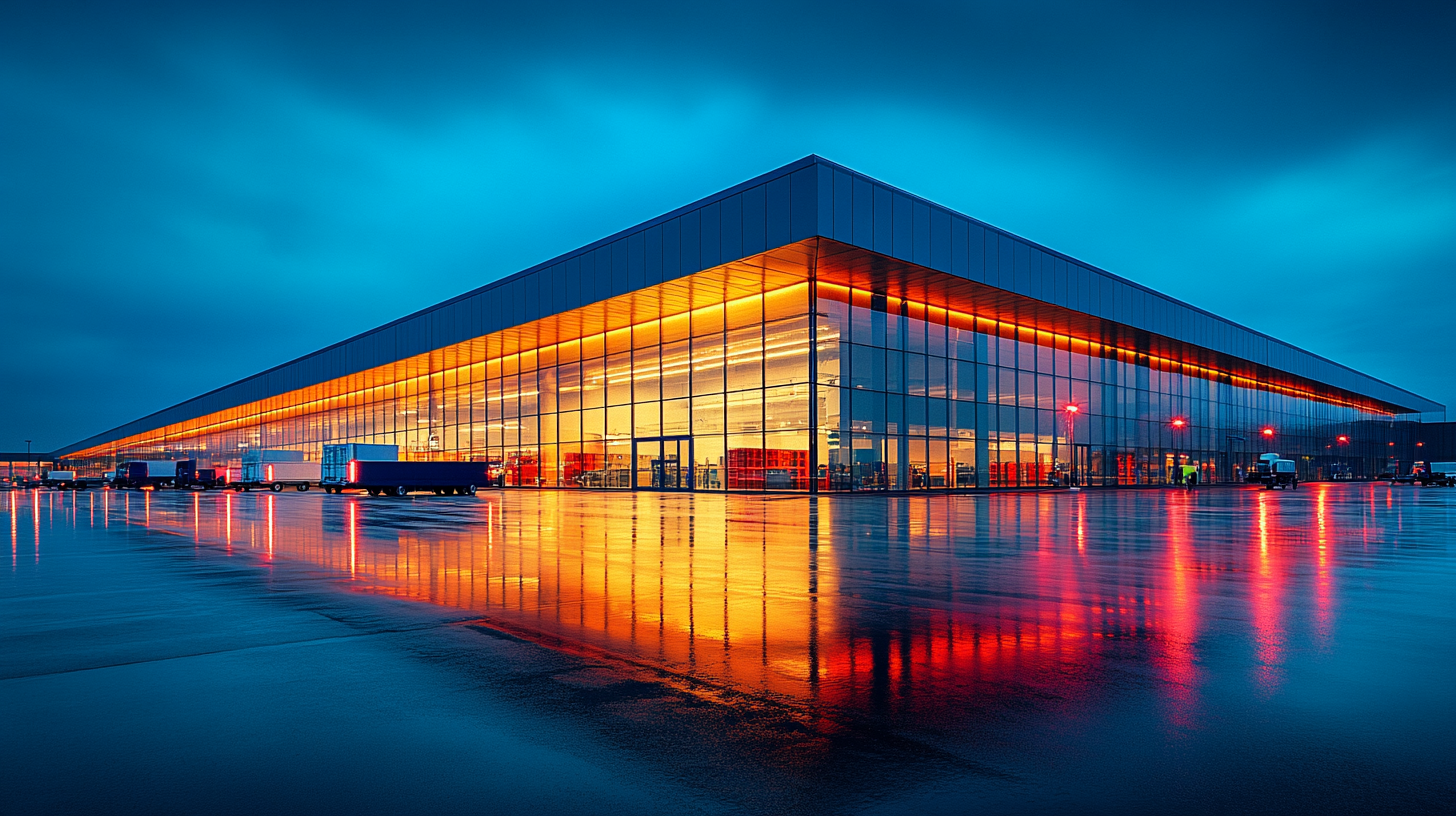
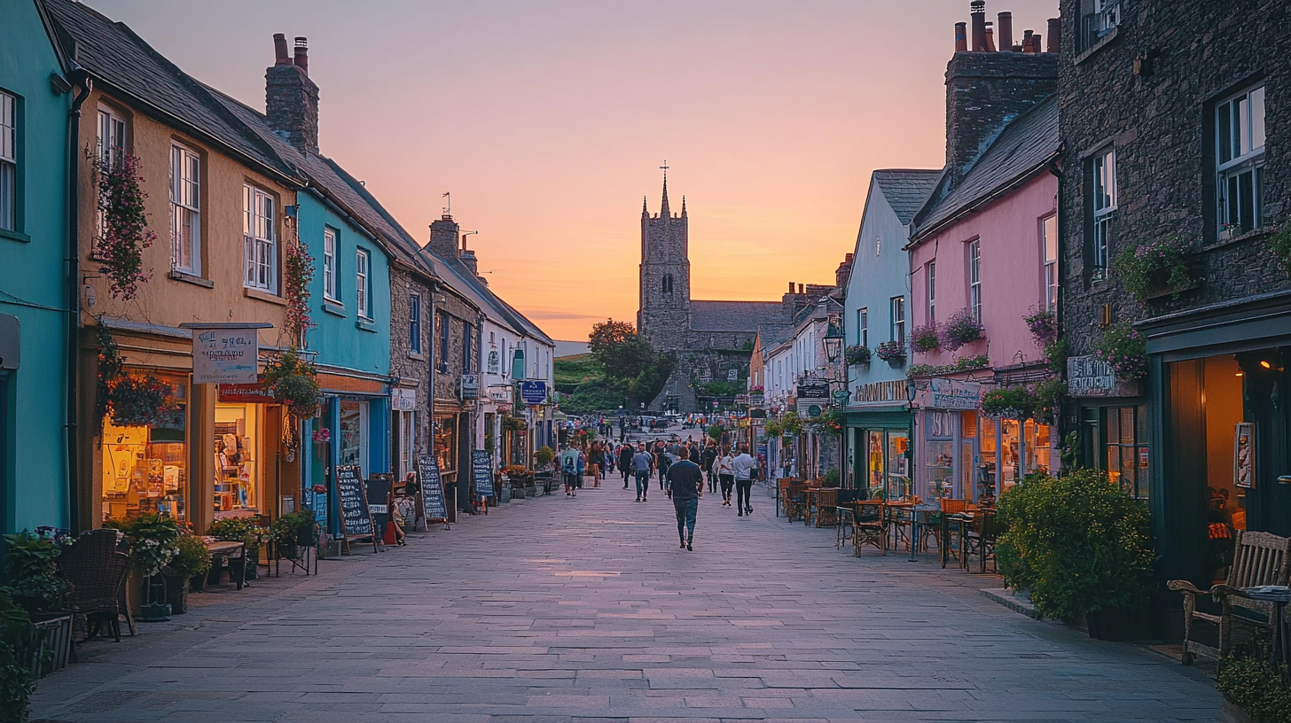
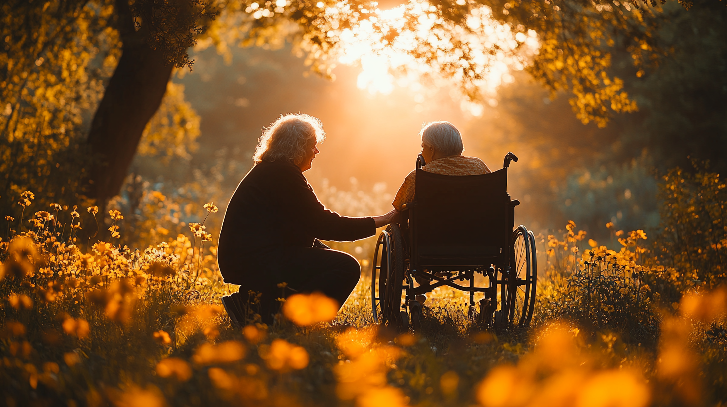
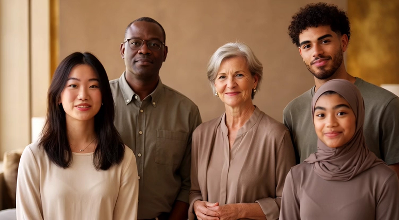
Photography
Style Guidelines
Photography plays a vital role in communicating the Oranda brand. Our imagery should feel authentic, warm, and purposeful - reflecting the human impact of our work in rare disease therapeutics.
01
Authenticity
Use real, natural photography wherever possible. Avoid overly staged or stock-looking images. People should feel genuine and relatable.
02
Warmth & Optimism
Imagery should convey hope and positivity. Favour warm lighting, natural tones, and compositions that suggest progress and possibility.
03
Scientific Rigour
When depicting laboratories, research, or medical settings, maintain an atmosphere of professionalism and precision without feeling cold or sterile.
04
Diversity & Inclusion
Ensure imagery represents the diverse communities we serve. People of different ages, ethnicities, and backgrounds should be represented authentically.
Image Treatments
Images on the Oranda website use specific treatments to maintain visual consistency:
Clip-Path Wipe
Images reveal via inset clip-path animation triggered on scroll
Blur to Focus
Content transitions from blurred to sharp as it enters the viewport
Parallax
Background images move at different rates to create depth
Photography
Image Bank
Browse and download approved brand imagery. Images are organised by theme for easy selection. Click any image to download at full resolution.
The Oranda digital experience is built from a consistent set of UI components. These components use glassmorphism, subtle animations, and the brand colour palette to create an immersive, premium feel.
Buttons
Buttons use the primary orange with a shimmer animation. On hover, they transition to an outlined state with a subtle lift.
Glass cards use a semi-transparent background with backdrop blur to create depth. They are used for content containers, testimonials, and interactive elements.
Glass Card
Semi-transparent background with backdrop blur creates depth and sophistication.
Interactive Card
Mouse-tracking glow effect on borders enhances the premium interactive feel.
Motion design adds life and polish to the Oranda digital experience. All animations should feel purposeful, refined, and never gratuitous. We use GSAP (GreenSock) as our animation framework.
Scroll-Triggered Reveals
Content elements reveal as the user scrolls, using fade-up animations with staggered timing to create a sense of flow.
Duration: 0.8sEase: power2.outStagger: 0.1s between siblingsTransform: translateY(40px) to 0
Image Clip-Path Wipes
Images reveal via CSS clip-path transitions, creating a curtain-like reveal effect that adds drama to hero sections and feature imagery.
Background elements move at different scroll rates to create a sense of depth. Used sparingly on hero sections and feature imagery.
yPercent: 30Trigger: top bottom to bottom topScrub: true
Button Shimmer
Primary CTA buttons feature a subtle light sweep animation that draws attention without being distracting.
Type: CSS linear-gradient animationDuration: 4s infiniteDirection: Left to right
Hover Transitions
Interactive elements respond to hover with consistent, smooth transitions. Never instant, never sluggish.
Duration: 0.3sEase: easeLift: translateY(-2px) on buttons
Digital
Accessibility
All Oranda digital materials are built to meet WCAG 2.1 Level A standards, with Level AA compliance achieved across most criteria. Accessibility is a core commitment of the brand, not an afterthought.
Compliance Summary
The Oranda website meets WCAG 2.1 Level A in full and Level AA on all criteria except colour contrast in light mode, where the brand orange (#E07850) falls below the 4.5:1 ratio required for small text against the cream background. This is a deliberate brand decision - the orange is central to the Oranda visual identity and darkening it sufficiently to achieve AA would compromise the warmth and character of the brand.
Dark mode is fully WCAG 2.1 AA compliant across all criteria, including colour contrast. Users who require enhanced contrast can switch to dark mode via the theme toggle.
Colour Contrast
In dark mode, all text meets the AA 4.5:1 minimum. In light mode, the brand orange on cream achieves approximately 2.7:1 - acceptable for large text and headings but below threshold for small body text. All non-orange text in both modes meets AA standards.
Keyboard Navigation
All interactive elements are operable via keyboard with visible focus indicators. Skip-to-content link is provided. Focus is trapped within modals and the mobile navigation drawer when open.
Screen Readers
Semantic HTML throughout with ARIA labels on all interactive elements. Meaningful alt text on content images, empty alt on decorative images. Live regions announce dynamic content updates.
Motion Sensitivity
The site respects the prefers-reduced-motion media query. All GSAP animations, CSS transitions, parallax effects, and autoplay videos are disabled or reduced when this preference is enabled.
Downloads
Logo Pack
Download the complete Oranda logo pack containing all approved logo variations in PNG, SVG, and EPS formats.
Complete Logo Pack
Includes full colour, monochrome, logomark, and logotype variants in all formats.